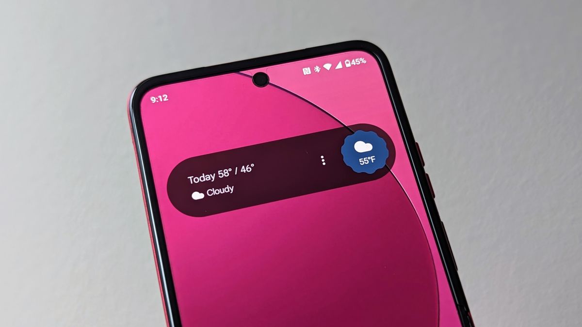
It looks hideous. Not everything needs to be a big ass pill shaped widget.
I’m getting tired of Google’s UI decisions all around and whoever sets these company wide design mandates needs fired quickly before they do even more lasting damage.
… especially the idiot behind the analogue clock design.
The Pixel can also get the new Assistant At a Glance widget, although the permanent At a Glance widget still remains in place and unchanged.
What’s the point then? I don’t need the same widget twice.
You can disable the old one in settings, so you don’t have to have it twice.
I got this today morning on my old android one phone. I don’t like it at all. It’s an eyesore.
Same here. I played around with the settings (extremely limited, typical of Google), but ended up just deleting the widget. I’m using Nova Launcher on a Pixel 6A. Hope it at least fits the default launcher UI better, otherwise it’s just terrible.
Unfortunately I can’t remove the widget and have to stare at it every time I unlock my phone. The phone is on android 10 so gesture navigation is not supported on 3rd party launchers. Hence using default launcher where I can’t remove that atrocity.


