Simple websites are better than beautiful ones. I'll repeat that for the folks in the back. Simple websites are better than beautiful ones. Let me be clear what I mean by a simple website. I don't mean a Wordpress site with a minimalist theme. I also don't mean a Substack …
I’ve been saying this for years. My site only has a few lines of javascript. the rest is pure html and css, and it’s very simple. https://tylerthrailkill.com
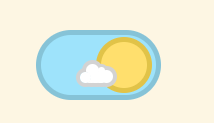
Your theme toggle is confusing, it shows the sun when the dark mode is enabled and vice versa
There was a thread elsewhere asking whether a toggle should show current state or the state desired. There was enough disagreement that it quickly became apparent that, whatever else the toggle does, there should be something external to the toggle showing the possible states, indicating which way to move the toggle regardless of toggle appearance.
The disagreement was actually all over whether the question was about a switch or a button, and so some people were answering as though it was a switch, and some people were answering as though it was a button - switches and buttons do indeed have opposite approaches usually (a switch usually shows the current state - such as “on” - but a button shows what action will be triggered by pressing it, such as “play”).
Oops! I guess I wasn’t paying close enough attention.
That’s ok - a lot of people weren’t.
that post is about toggle buttons, not switches. e.g. a play pause button, when pressed, does it show play, or does it show pause?
Oops! I guess I wasn’t paying close enough attention.
still, people are clearly confused by the button. I’m just gonna make it an animation and prefers-color-scheme since that’s so widely supported now.
there it is
It really depends on the type of control and what it’s controlling. As this is a switch, you’d expect the current state to be what’s shown on the same side as the slider-- in this case, the slider is a sun in dark mode and a moon in light mode, which is the opposite way.
The designer team once did a toggle button with the inverse logic and I was so confused when I had to implement that. It must be my antithesis.
It did nothing when clicking it the first time and only changed the second time I clicked it
I’ve wondered what this problem was for years but never cared to figure it out, because it always resolved after the first button press (just refresh the page and it all works properly). turns out it is something wrong with my use of local storage to save your theme state. if you don’t have the key in local storage then it does what you mentioned. I just need to switch this to prefers-color-scheme anyway.
Strange, it’s the exact opposite for me. Moon in dark mode, sun in light mode.
Hey - the poster isn’t actually the author. That would be me! Thanks for the feedback though. I normally just use Dark Reader for switching theme.
Hm. what browser are you on? It is showing sun for me on light mode.
It works if you visited the website already but the first time it breaks: reloading fixes this while emptying the caches breaks it again. As another user pointed out the first click after emptying the cache doesn’t do anything at all even though the animation plays out just fine
EDIT: I’m on safari ios, latest stable (17.3.1 if I’m not mistaken)
In dark mode you press it to go light mode, and in light mode you press it to go dark mode, but yeah, strictly speaking should’ve used a button rather than a switch for that usage.
It shouldn’t be like that. on my computer it shows the sun when it’s in light mode, moon in dark mode.
It comes up like that the first time, but then changes once you hit the switch a few times
Same–I use a line or two of PHP to avoid duplicating common header/footer elements, but it’s otherwise HTML and CSS (no JS at all).
https://owenfromcanada.com