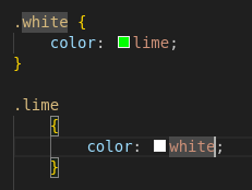
GregorTacTac@lemm.ee to Programmer Humor@programming.dev · 1 year agoAverage CSSlemm.eeimagemessage-square33fedilinkarrow-up110arrow-down10file-text
arrow-up110arrow-down1imageAverage CSSlemm.eeGregorTacTac@lemm.ee to Programmer Humor@programming.dev · 1 year agomessage-square33fedilinkfile-text
minus-squareMonkderVierte@lemmy.mllinkfedilinkarrow-up0·1 year agoNowadays we do responsive webdesign instead of micromanaging widths.
minus-squareusernamefactory@lemmy.calinkfedilinkarrow-up1·1 year agoThis is technically responsive, but I think you have a fair criticism. A single rule like this would be much more maintainable: #content .grid-container { width: 90vw; min-width: 12rem; max-width: 75rem; padding: 2rem 0 1rem; } Obviously, media rules have their place, but not for something that’s consistantly a full width container like this seems to be.


Nowadays we do responsive webdesign instead of micromanaging widths.
This is technically responsive, but I think you have a fair criticism. A single rule like this would be much more maintainable:
#content .grid-container {
	width: 90vw;
	min-width: 12rem;
	max-width: 75rem;
	padding: 2rem 0 1rem;
}
Obviously, media rules have their place, but not for something that’s consistantly a full width container like this seems to be.