
3·
1 month agoThanks. It’s an Orca feature. Not Cura.
Thanks. It’s an Orca feature. Not Cura.
Please indulge me.
I do the negative when text is on the side of the part but at the bottom this seems to be better , especially for thick bold letters.
It really is t bad in the naked eye. I just slammed a reflection right on it. Or maybe was 0.01mm too high but I’ve seen way worse.
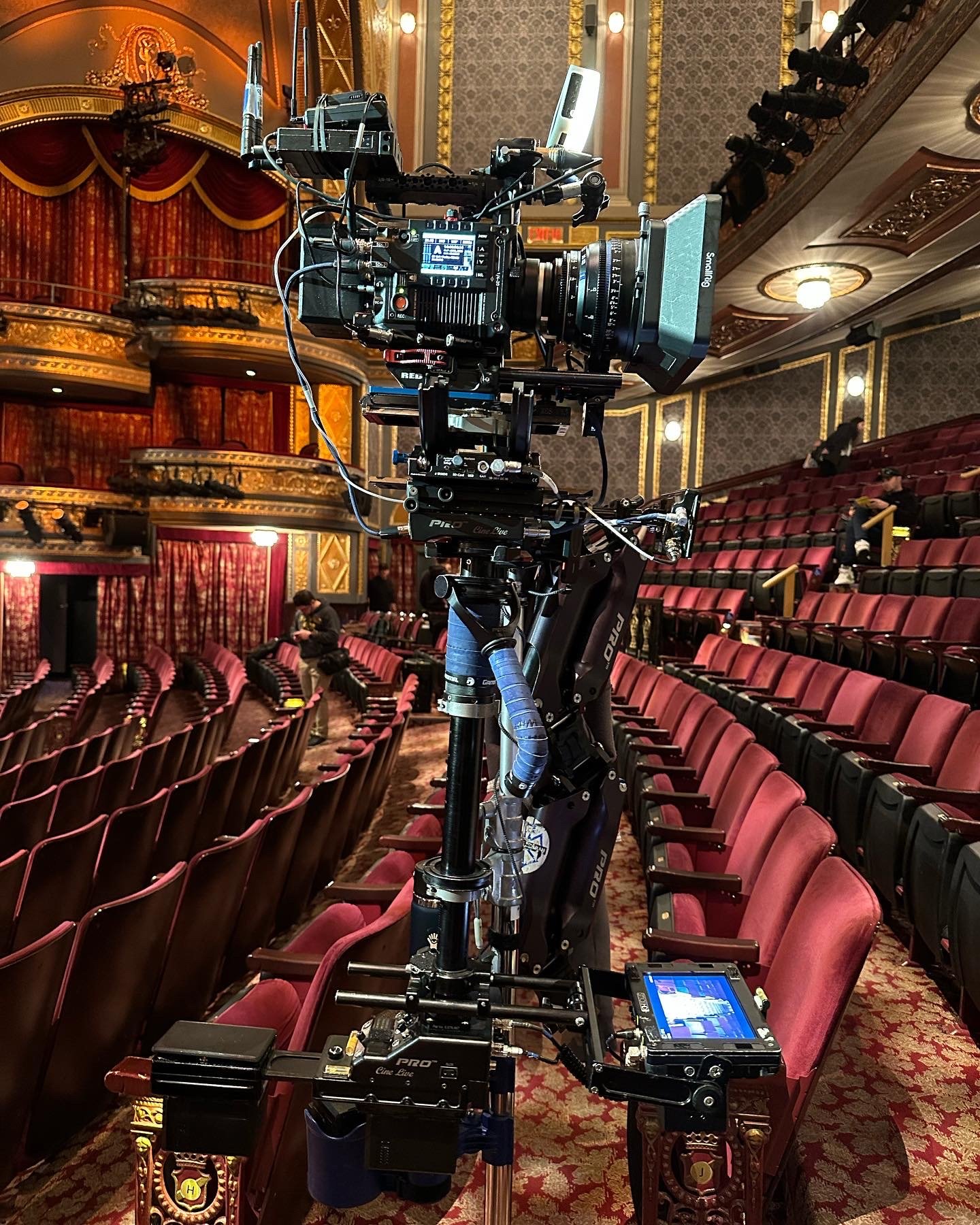
Here’s a picture of the part assembled. 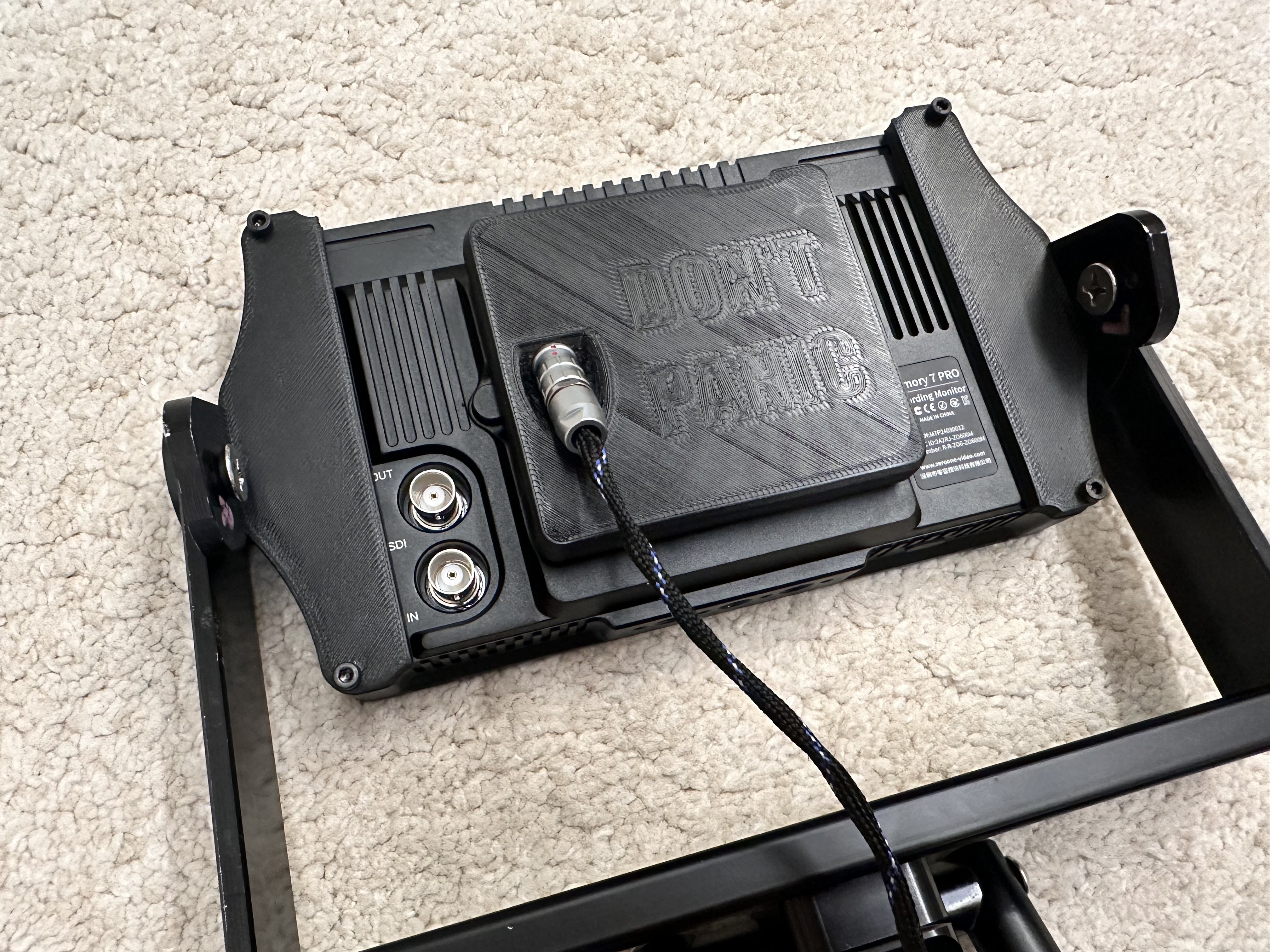

Wow. You must be fun at parties.
Ok, now do you get the irony? Or you’re the only one with limited time?
Also, it’s just a prototype. You’re complaining about how bad the special effects are while reading the script of a movie.
Great idea! Wanna get on it?
What’s the connection with the original post?
What is this? I Minecraft knockoff?
Look for the modpack Additive It’s based on Fabric with some great mods oriented towards speed and QOL which replace OptiFine in one package.

I deleted my comment after realizing that.
deleted by creator

Here are the photos (from X):
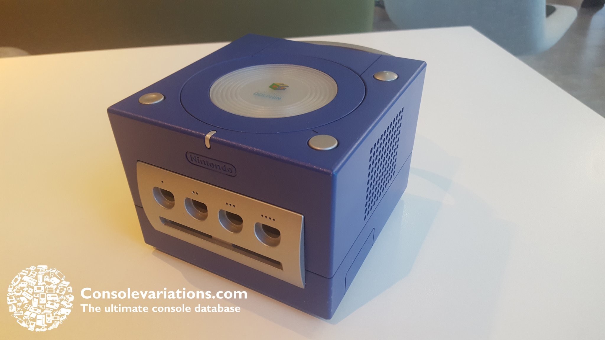
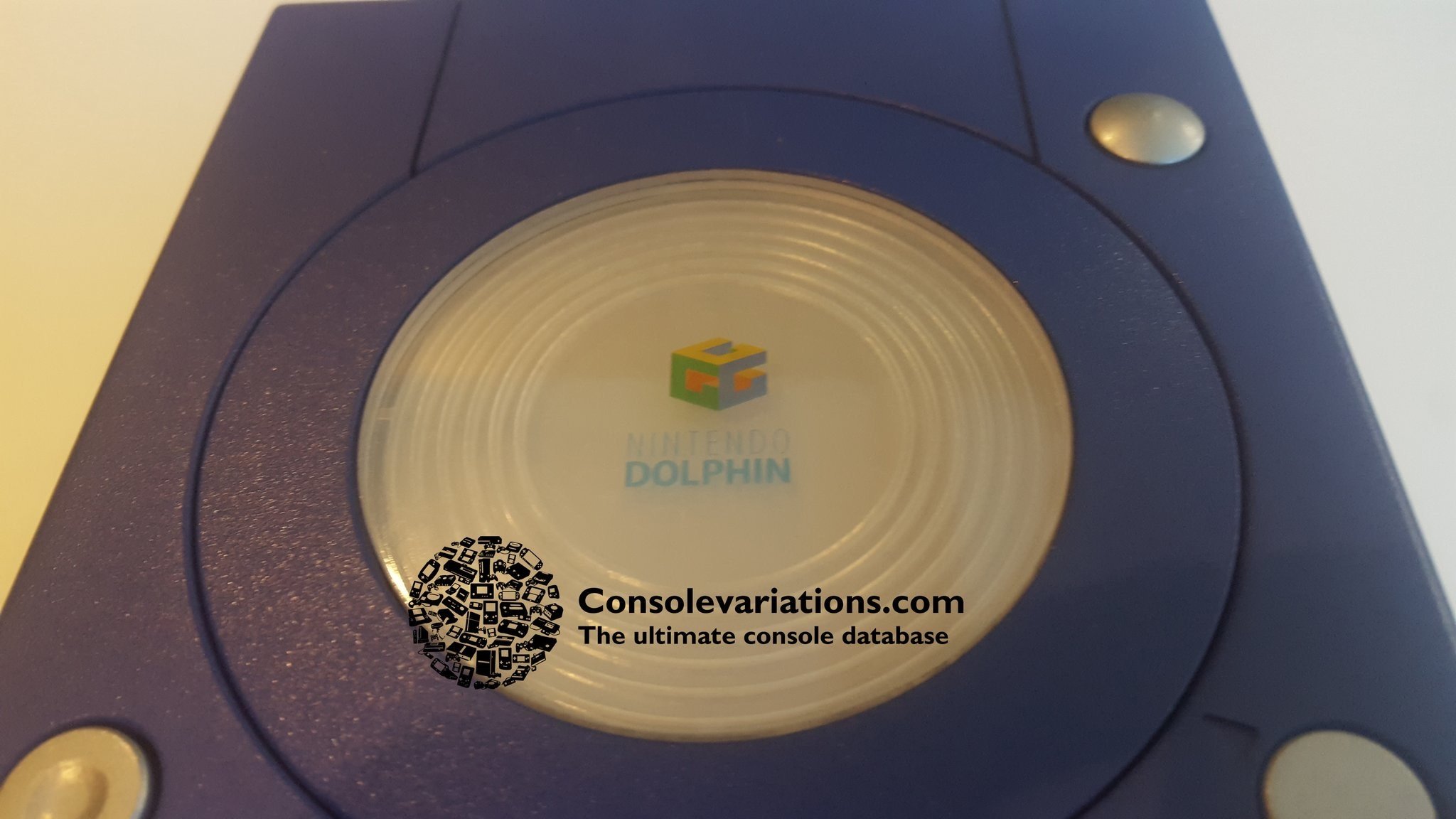
It’s a GameCube with a Dolphin name printed on it. Dolphin was the development name of the console which also gave the name of the emulator.
ADHD brother/sister?
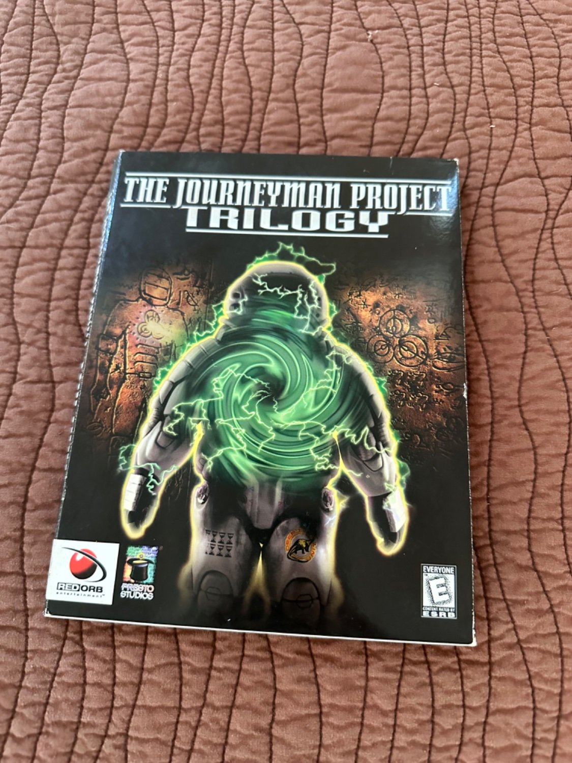
I highly recommend the third one.
They’re on Internet archive… for archival reasons… 😉
What were the other ones?
Now I want to make a AI Smart home assistant modeled on Arthur. With that little robot on a mirror hologram or something…


You should already know that. It’s such a simple thing. — first answer on StackOverflow