You must log in or register to comment.
I love Material’s dynamic color changing based on the background’s palette, but it’s still just flatshit with extra steps
What do you mean?
Totally flat design is getting boring to me, I want something that’s more bold. It’s just subjective preference.
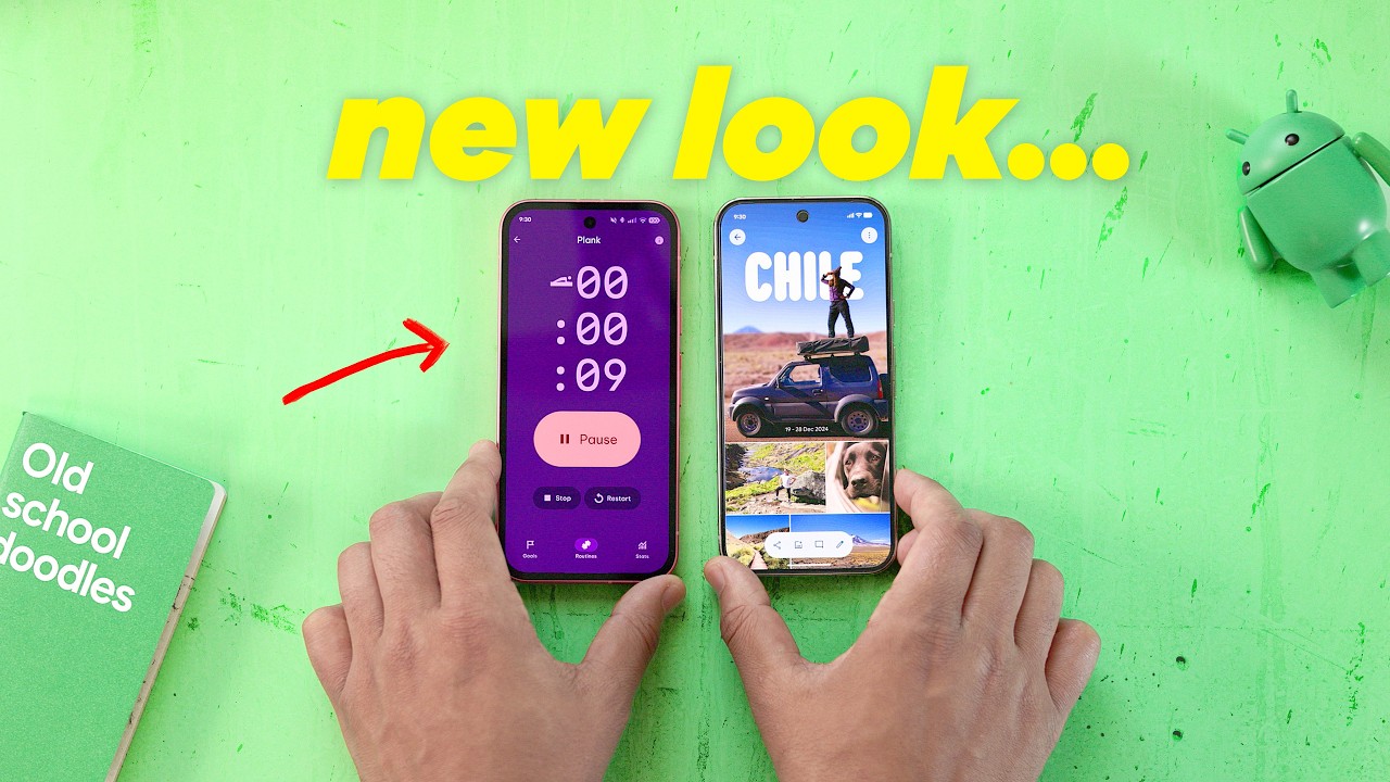
I trained some elderly relatives to look for green phone icon to pick up a phone as it seemed really distinct and consistent on all call apps I tried. Now there’s no colors, just fancy animation?
Fuck Google!