Heroes of Might and Magic: Olden Era is the official prequel hailing back to the origins of the genre-defining, critically acclaimed series of turn-based strategy games. Recruit heroes, conquer fantastic lands, and overcome your foes in this single player demo.
I agree that there is something bland about the aesthetics of the game. From a distance (or in a thumbnail), it looks very good and faithful to the art style of the original games, just with some extra bells and whistles. However, upon closer examination there is something about the design language which feels like I’m looking at a mobile game ad. It could be that I associate HoMM with a hyper specific micro genre of fantasy art. My views are very HoMM 2 coded, and that game feels its art was ripped from the book jackets of Del Rey and Tor published paperbacks circa 1987. I love the look, especially the hero portraits.
So, this new look doesn’t really do anything for me. I’m not knowledgeable enough to suggest that AI was used to design some of these assets, but that’s the impression the art gives me, which I’m sure was not their intent.
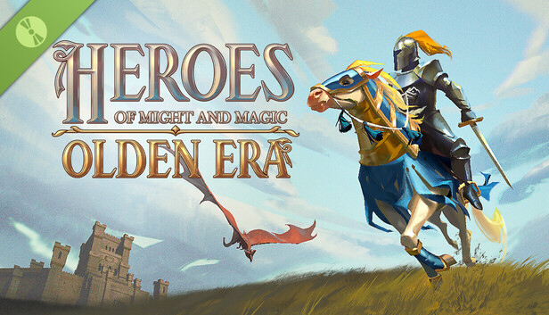