

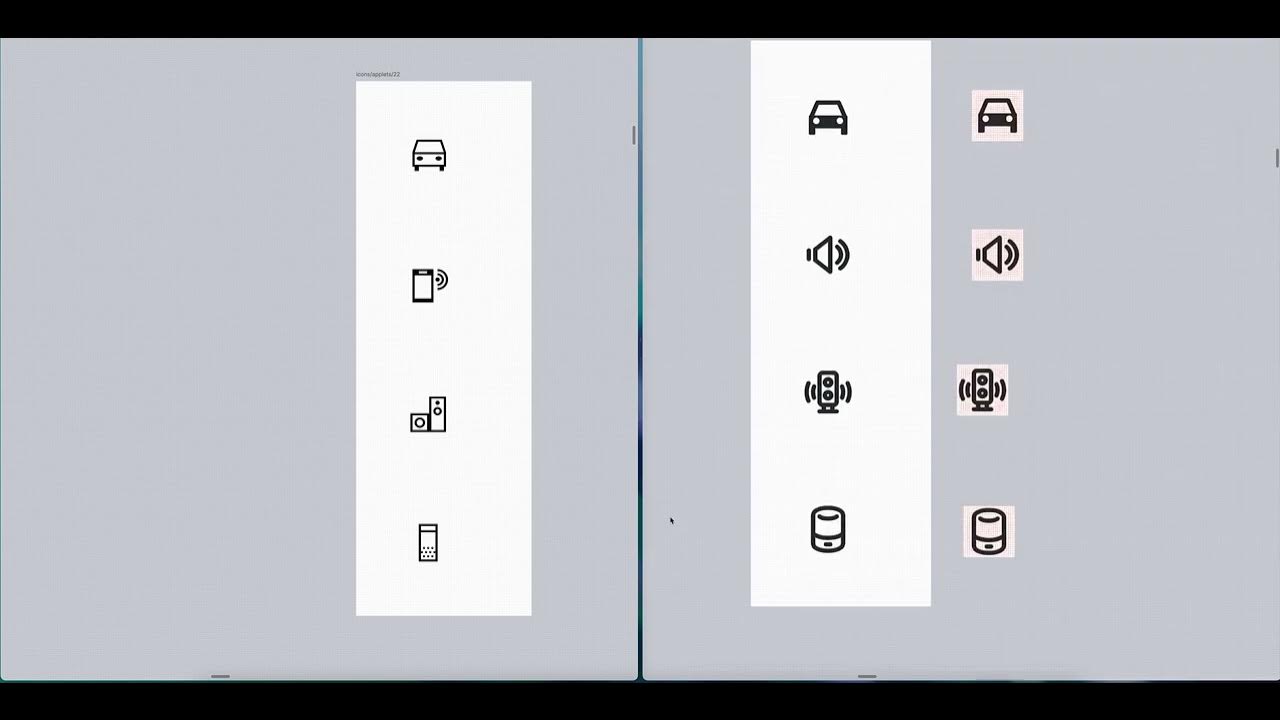
Removing the color-coding of mimetypes, for accessibility for “color blind” people. (Like me!)

(this is not my work, just posting here)
Removing the color-coding of mimetypes, for accessibility for “color blind” people. (Like me!)
(this is not my work, just posting here)
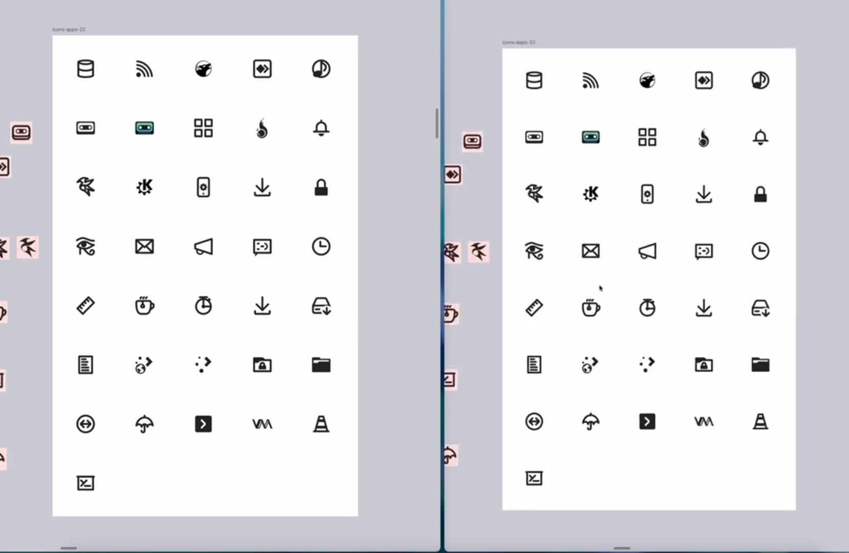
I’m so glad they decided to make the lines thicker. I always thought the Breeze icons were ugly because of their 1px outline style. It’s hard to see and lacks weight. Liking the improvement here.