Tony Bark@pawb.social to Not The Onion@lemmy.worldEnglish · 2 months agoCracker Barrel’s New Logo Has Right-Wingers Posting About Sydney Sweeney, Finding Jesuswww.rollingstone.comexternal-linkmessage-square95fedilinkarrow-up1224arrow-down18file-text
arrow-up1216arrow-down1external-linkCracker Barrel’s New Logo Has Right-Wingers Posting About Sydney Sweeney, Finding Jesuswww.rollingstone.comTony Bark@pawb.social to Not The Onion@lemmy.worldEnglish · 2 months agomessage-square95fedilinkfile-text
minus-squaremegopie@lemmy.blahaj.zonelinkfedilinkEnglisharrow-up15arrow-down2·2 months agoHonestly, If they changed the logos of things but did’t gut the quality… it would really not matter.
minus-squareRyktes@lemmy.worldlinkfedilinkEnglisharrow-up22·2 months agoOh yeah, fair. I just personally hate that all major business logos now seem to just be the name on a single color background. I miss when logos had personality.
minus-squarefrunch@lemmy.worldlinkfedilinkEnglisharrow-up32·2 months agoI really think they’re finding the last corners they can cut for profit, meager as it may be. Less colors, less details, less $ to print. That’s my theory at least. Another good example of what you’re talking about is the Pringles guy:
minus-squarenilloc@discuss.tchncs.delinkfedilinkEnglisharrow-up2·2 months agoI already call it DD when I cave to needing a quick coffee when I’m running late.


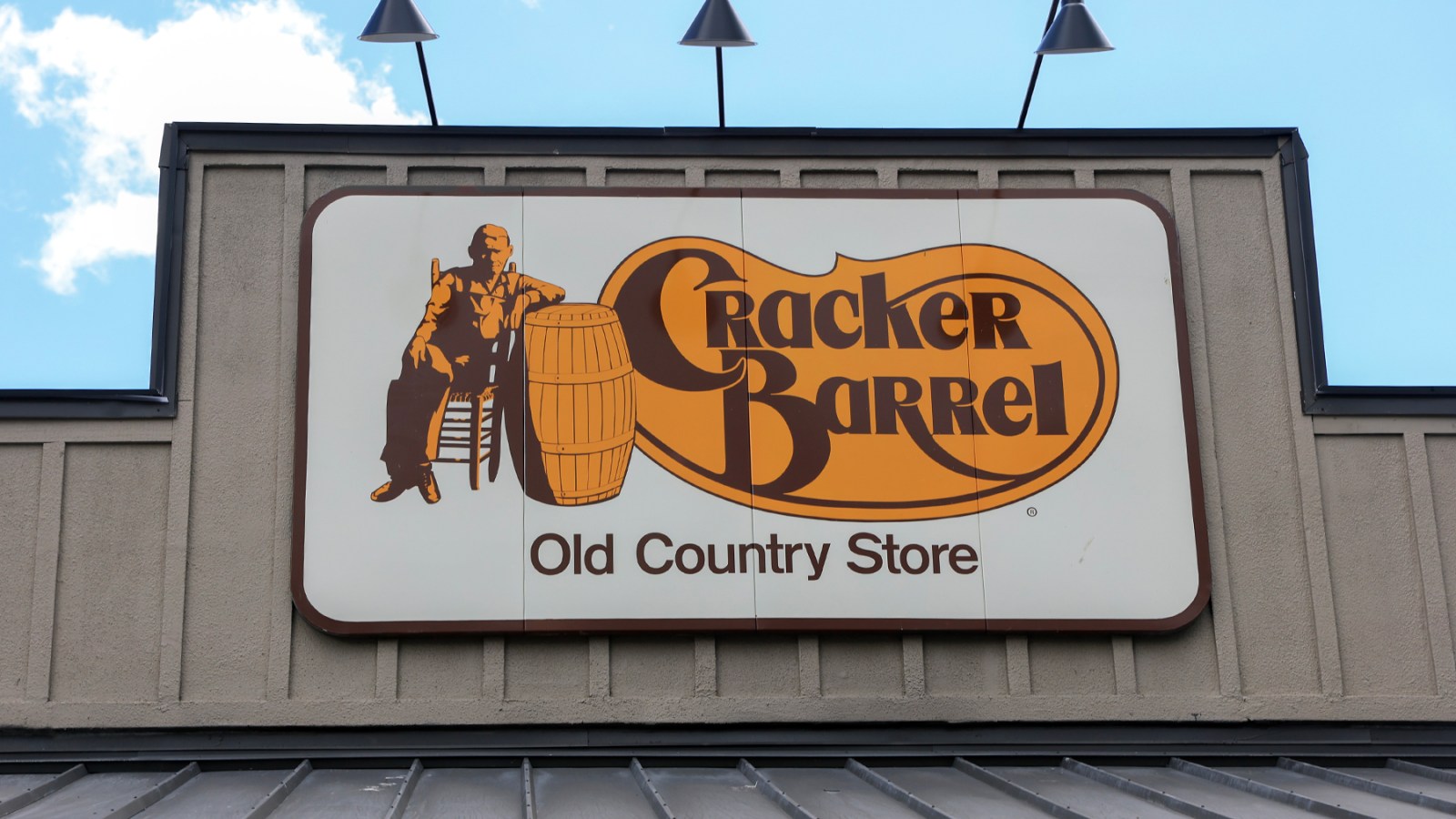
Honestly, If they changed the logos of things but did’t gut the quality… it would really not matter.
Oh yeah, fair.
I just personally hate that all major business logos now seem to just be the name on a single color background. I miss when logos had personality.
I really think they’re finding the last corners they can cut for profit, meager as it may be. Less colors, less details, less $ to print. That’s my theory at least. Another good example of what you’re talking about is the Pringles guy:
D
I already call it DD when I cave to needing a quick coffee when I’m running late.