It’s in the eye of the beholder, of course. But it would be great to see some solid recommendations.
I think GNOME looks very visually appealing with it’s consistency. The Libadwaita library has a nice aesthetic and looks very clean with nice spacing for elements to “breathe”.
I still prefer KDE since I can tailor the look to my needs and I prefer to have clutter over extra clicks. (I have top bar with “Opened programs”, Launcher, System tray, Time and a global menu and KWin script for managing Activities)
I feel like modern era of design has gone a bit overboard with the “clean” direction. It can be contrasted with Windows XP where you click “All programs” and you literally get all programs in the start menu with options of how to run or open them. I prefer to do “Menu” - > “Submenu” - > “Thing I want”.
Come to think of it I should probably make a launcher for KDE.
The distribution doesn’t to too much, its mostly the desktop environment. I like the look of KDE Plasma the most. But usually I craft my own look after a while.
I like the look of KDE Plasma the most.
GNOME vs KDE gang fight has been summoned.
The look of GNOME isn’t the problem of GNOME. ;-) I’m not a good citizen right now.
Well GNOME has issues but in terms of look it’s 69420x better than KDE.
The thing I’ve learned in the many years of watching this fight is that the things Gnome people (of which I am one, though I have immense respect and appreciation for the KDE project) don’t like about KDE tend to be the things KDE people like about KDE and vice versa.
These projects are almost diametrically opposite. GNOME tries to provide a very simple, solid but not very configurable desktop with good accessibility and stability while KDE tries to make a very configurable and powerful environment that can be customized to anyone’s needs. I don’t like KDE because it’s unstable, way too powerful for my personal needs (their “simple by default; powerful when needed” concept doesn’t really work) and I just don’t like the UI. Though KDE’s better performance is an objective advantage.
I tend to agree. I mean, the gnome workflow is more appealing to me (though I have since moved to a WM), but my dislike of KDE comes down to (a) too many options everywhere and (b) it looks too “sharp”. If KDE had an “I’m done fiddling” mode that hid most of the options and I found a softer theme, I’d probably like it fine.
Absolutely nothing I just said should take away from others’ preference for KDE. I’m glad we can like what we like.
I don’t think it’s the distros job to look visually appealing. That’s the job of the desktop environment. Seriously I wish distributions would just ship vanilla desktop environments. All of the themed variants always have some issues. Maybe I’m just old and stubborn but that’s my opinion.
You’re asking about the desktop environment and its default settings, which may or may not be the same on any given distro.
But I have a tie between Plasma and Cinnamon (mint’s DE). They both take only minor tweaking to get where I want them, and I can use them both out of the box with zero complaints.
Mint with Papirus icons and blue accent colour set to match the folder icons of Papirus theme.
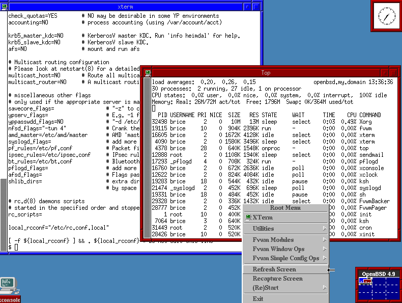
Definitely OpenBSD’s default fvwm


