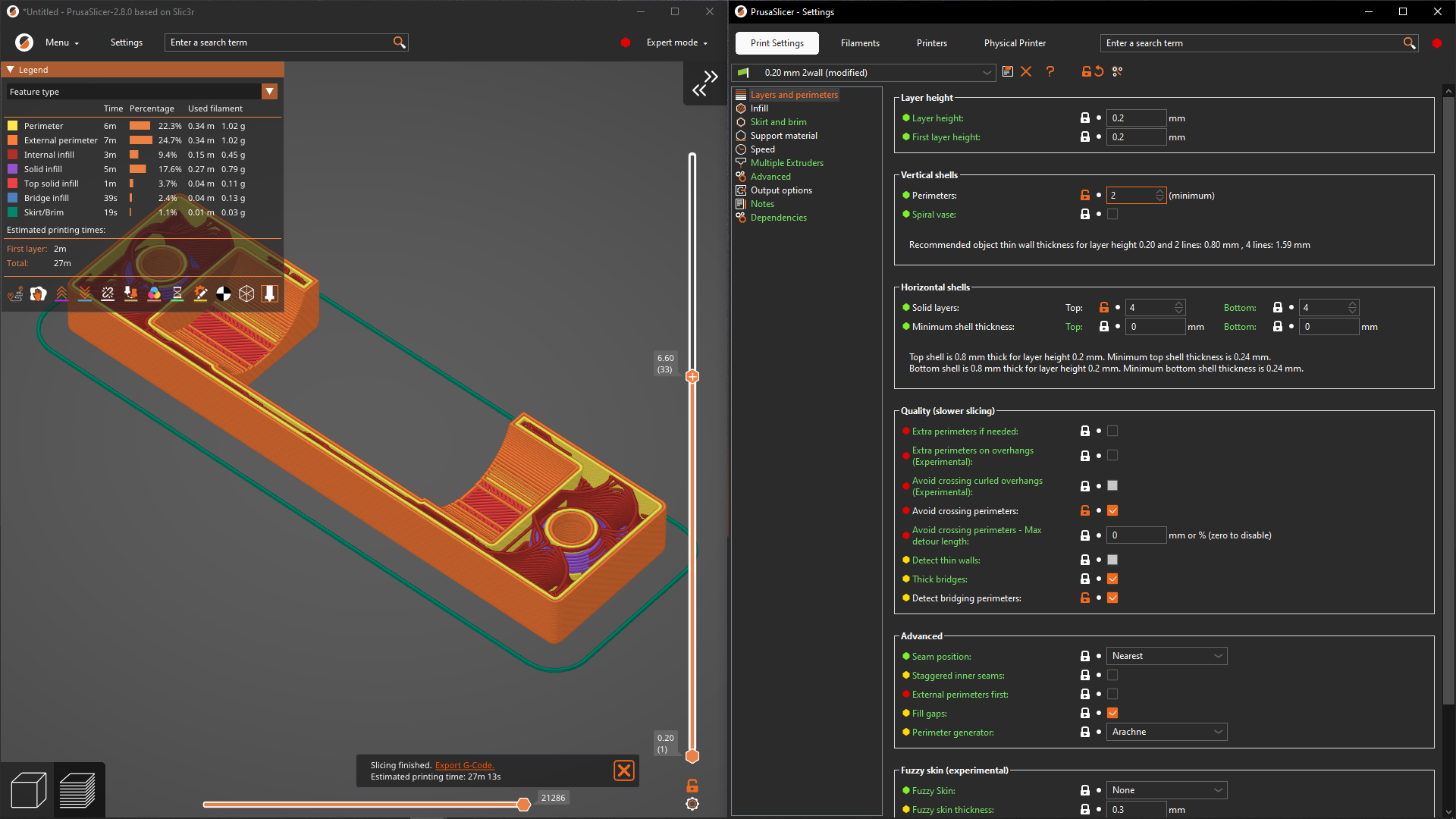

Screenshots of the UI changes on the Mac - in my opinion it is now just wasting a lot of screen estate for zero benefit.
On non-Macs they’re adding an extra usability issue by hiding the top menu bar. I’ve gove back to 2.7.4 for now - fortunately I had my configuration in git.
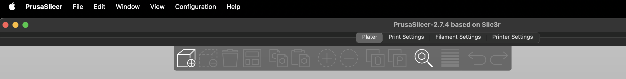
Up to 2.7.4:
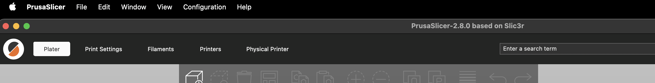
2.8.4:
And on Linux it looks even less native now
On pc there is a setting to revert to old menu bar appearance.
On Windows: I hate it too.
Takes up more space without any benefit. this version looks “modern” but from a usability standpoint, it is worse.
Hope Prusa goes in and makes the toolbar (Menu, Platter, Print Settings, filament, Printers, physical printer) small/less height and gives the buttons something to make them look like a button. Right now it is just text on a grey background. Big steps in the wrong direction in my opinion as it stands but easy to fix.
The addition of the physical printer page/tab is nice. Now I can view the Duet web interface directly in prusaslicer. While the printer are 99% upload and forget from time to time I need to view the control panel to check or adjust a thing or two.
Takes up more space without any benefit. this version looks “modern” but from a usability standpoint, it is worse.
Gnome 3’s guiding philosophy
There is some good stuff in this release. Go to Preferences > GUI and check “Show sidebar collapse/expand button” + “Settings in non-modal window”. Now you can put the Preview and Print Settings windows side-by-side, and see the result of every change immediately. This also requires “Background processing”, but that’s been available for ages.