Fucking really? When they fired huge percentage of the kitchen staff and ruined service, when they switched the suppliers to cheaper and mostly pre prepared ingredients, when they cut potion sizes and jacked prices. That was fine, no problem… but, they changed the logo… slightly? DISASTOR!
Like, this really is what I find absurd. That people are so willing to let their discontent be redirected to symbology, rather than question systems making things materially worse.
As insignificant as a mid quality restaurant chain is, it just seems emblematic.
As insignificant as a mid quality restaurant chain is, it just seems emblematic
Because it’s a perfect representation of their cult behavior. Brainwashed into only caring about surface level snapshots of issues instead of actual material details.
That said, new logo is actually trash compared to the original. Can we please just let this trend of minimalist corpo slop die already!?
I really think they’re finding the last corners they can cut for profit, meager as it may be. Less colors, less details, less $ to print. That’s my theory at least. Another good example of what you’re talking about is the Pringles guy:


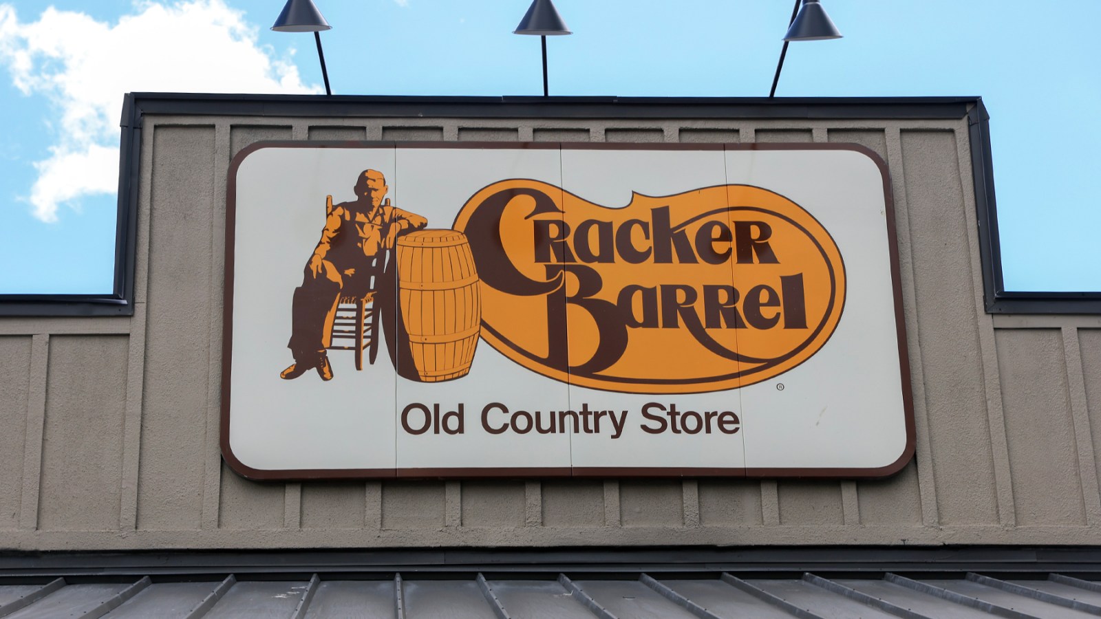
Fucking really? When they fired huge percentage of the kitchen staff and ruined service, when they switched the suppliers to cheaper and mostly pre prepared ingredients, when they cut potion sizes and jacked prices. That was fine, no problem… but, they changed the logo… slightly? DISASTOR!
Like, this really is what I find absurd. That people are so willing to let their discontent be redirected to symbology, rather than question systems making things materially worse.
As insignificant as a mid quality restaurant chain is, it just seems emblematic.
Because it’s a perfect representation of their cult behavior. Brainwashed into only caring about surface level snapshots of issues instead of actual material details.
That said, new logo is actually trash compared to the original. Can we please just let this trend of minimalist corpo slop die already!?
Honestly, If they changed the logos of things but did’t gut the quality… it would really not matter.
Oh yeah, fair.
I just personally hate that all major business logos now seem to just be the name on a single color background. I miss when logos had personality.
I really think they’re finding the last corners they can cut for profit, meager as it may be. Less colors, less details, less $ to print. That’s my theory at least. Another good example of what you’re talking about is the Pringles guy:
D
I already call it DD when I cave to needing a quick coffee when I’m running late.
A lot of folks lack curiosity.
They fired Brad’s wife